Project
Lineage Acupuncture: Healing with Heritage
Brand Design, Print Design, Advertising
Introducing Lineage Acupuncture's Brand Identity
At the heart of Lineage Acupuncture lies a profound respect for the ancient art of healing passed down through generations. My design work for them aimed to encapsulate the essence of this venerable practice through modern branding elements that resonate with tranquility, heritage, and the natural balance of life.
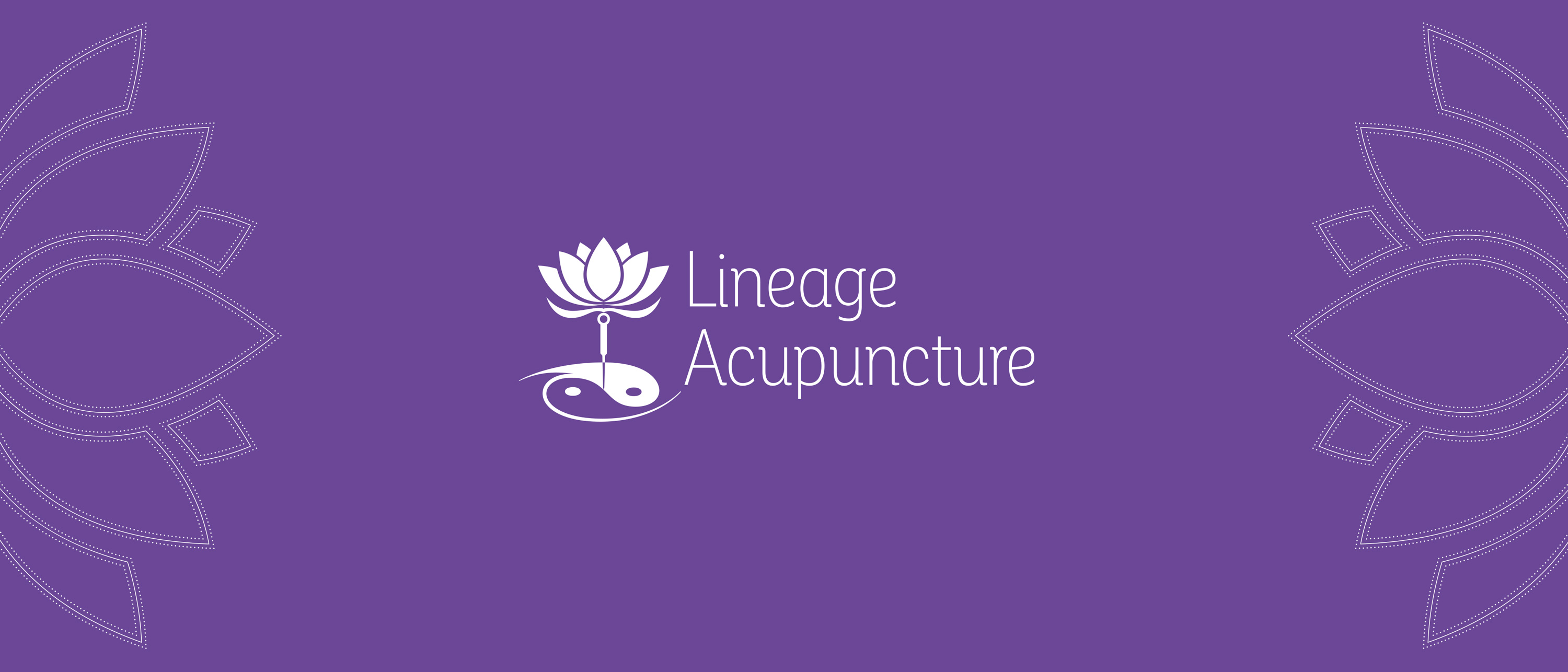
The Creation of a Timeless Logo
The logo is a harmonious blend of traditional symbolism and contemporary aesthetics. It features a precisely placed acupuncture needle at the yin-yang's center, symbolizing balance and precise intervention, from which a lotus – a universal symbol of purity and enlightenment in Eastern cultures – emerges, representing growth and the blossoming of health.
A Palette Reflecting Peace and Nature
The color scheme employs a soft pastel violet evoking a sense of royalty and lineage, while green accents highlight the natural and holistic approach to well-being. This choice of colors seeks to invoke a sanctuary-like atmosphere, inviting clients into a space of serenity and healing.
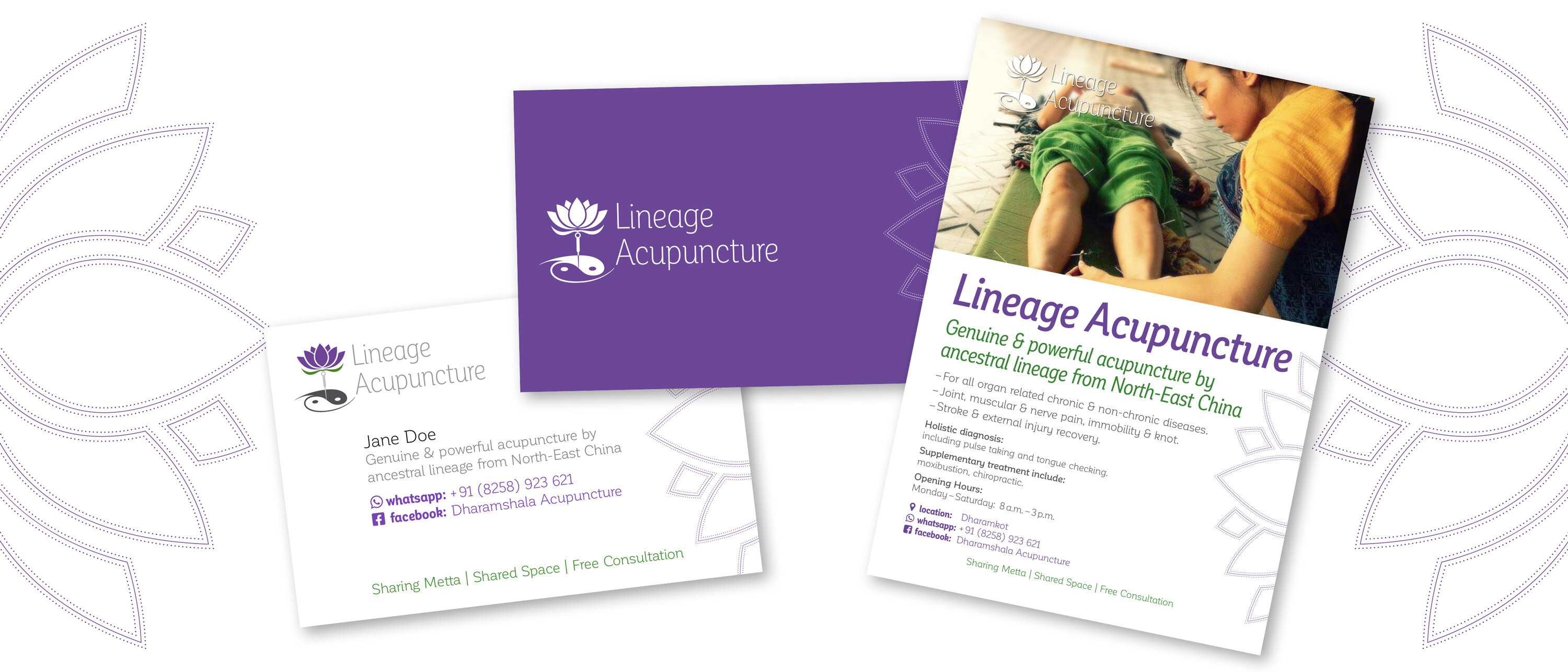
Designing for Impact: Business Cards and Flyers
The business card and flyer designs carry forward the logo's symbolism, integrating the key visual elements to create a cohesive and inviting look. The information layout balances clarity with aesthetic appeal, ensuring that the brand's message of genuine and powerful healing is communicated effectively.
Share