Project
Marinezirkel: Navigating Tradition into Modernity with TYPO3
Brand Design, Extensions, TYPO3 Package, Web Design
Charting a New Course for Marinezirkel
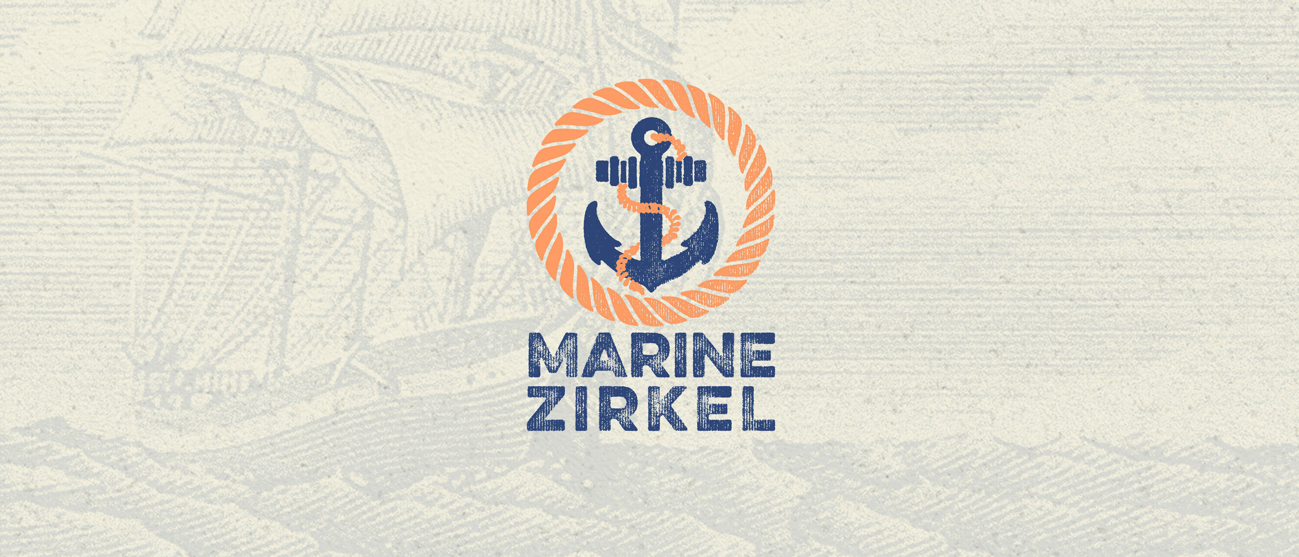
Marinezirkel, an esteemed non-profit sailing organization, embarked on a voyage into the digital seas with no prior compass of branding. My task was to erect a visual masthead—a logo and website that would herald their rich sailing tradition into the modern era. Drawing inspiration from 15th-century nautical charts and the rugged beauty of sail ships, I created a logo that is a beacon of camaraderie and guidance on the vast waters of connectivity.
From Wood Carvings to Pixel Perfection
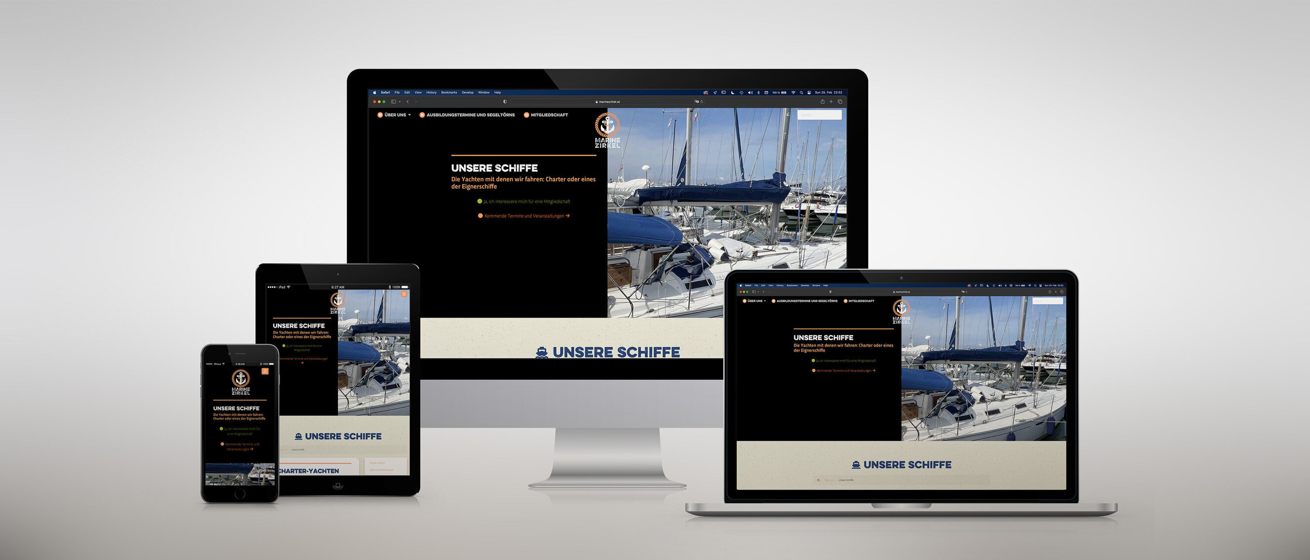
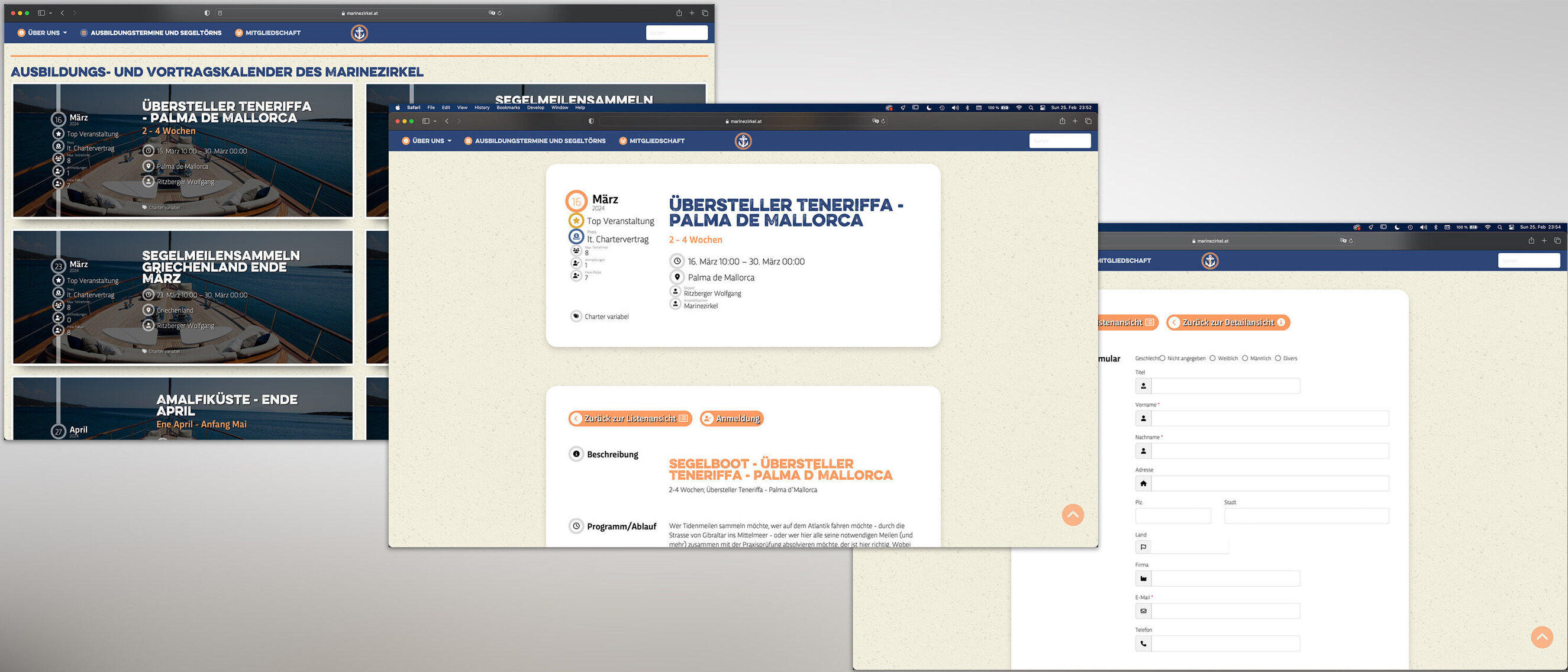
I steered the TYPO3 website package through the currents of design, anchoring it with hand-drawn elements that echo ancient wood carvings. Each line, a wave from the past; each curve, a gust of contemporary winds. The website mirrors the timeless flow of the ocean with a sleek interface, intuitive navigation, and a color palette inspired by the deep blues of the sea and the vibrant salmon hues that sailors chase on the horizon.
A Spectrum of Maritime Colors
The color palette was meticulously chosen to reflect the depth and vitality of sailing life. The profound blues resonate with the trust and stability of Marinezirkel's reputation, while the vibrant light salmon hue, akin to a sailor's twilight—symbolize the passion and adventure inherent in the sailor's journey.
A Beacon for Sailors Old and New
The Marinezirkel logo, now a proud emblem on the website, invites members and enthusiasts to anchor their passion for sailing. With the TYPO3 platform, the organization charts courses for training, voyages, and camaraderie, all under the new flag I had the honor of crafting.
Share
Related projects


