Project
MoriElement: Harmonizing Healing with Sacred Geometry
Brand Design, Print Design, Advertising
Crafting the MoriElement Brand
Embarking on the MoriElement branding journey, the challenge was to encapsulate the essence of alternative healing through the lens of sacred geometry, an emblem of universal balance and harmony. My design ethos for MoriElement was to create more than a logo—it was to forge an emblem that speaks to the soul's journey towards healing and equilibrium.
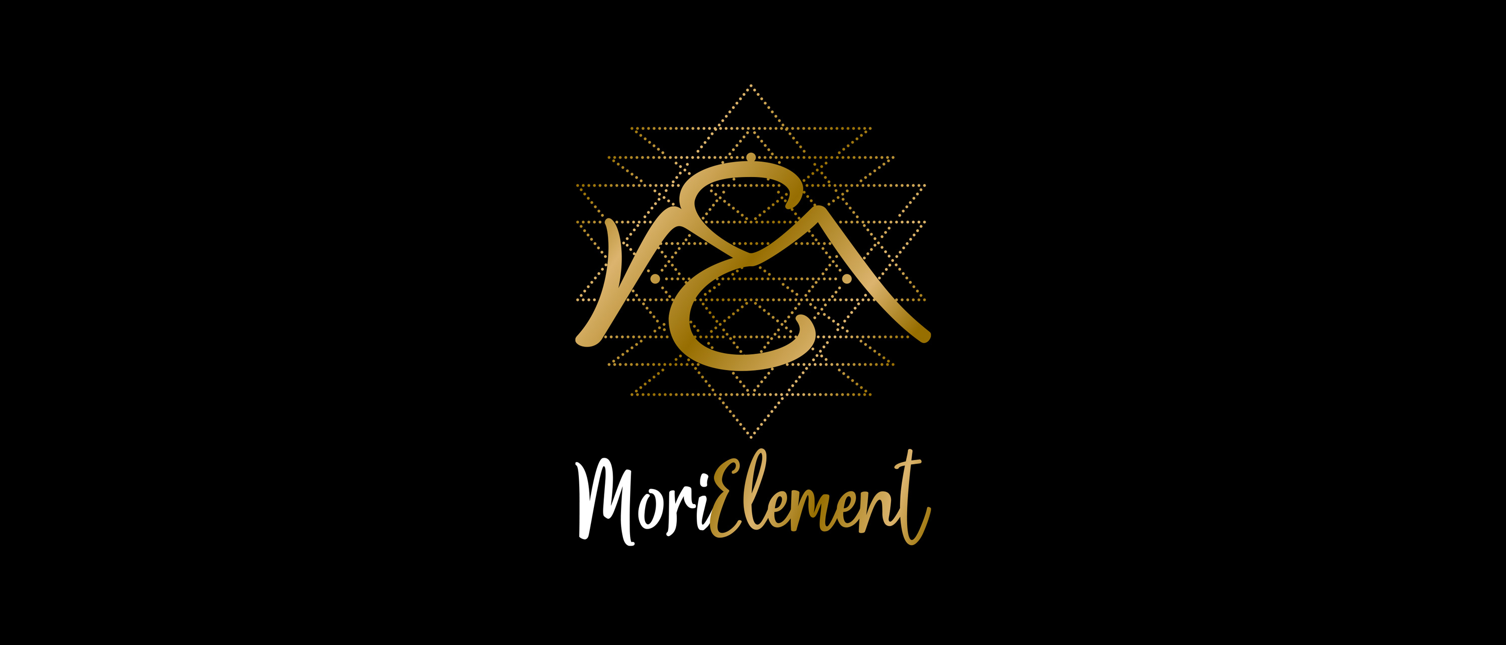
The Geometry of Healing
I delved into the mystique of ancient symbols, crafting a logo that serves as a beacon of healing—each line, a narrative of growth; each angle, a promise of balance. The logo's golden accents are not just a nod to refinement but a homage to the timeless wisdom that gold represents in the realm of healing and spirituality.
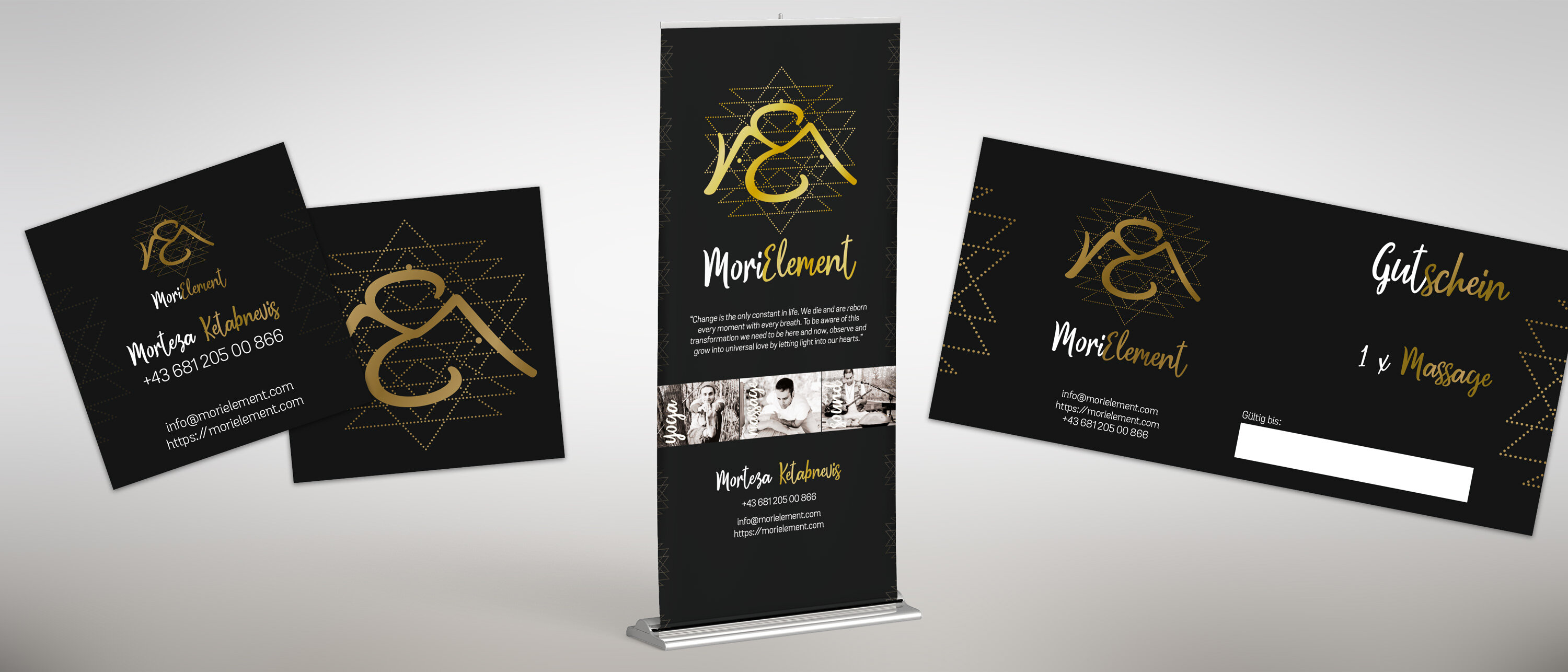
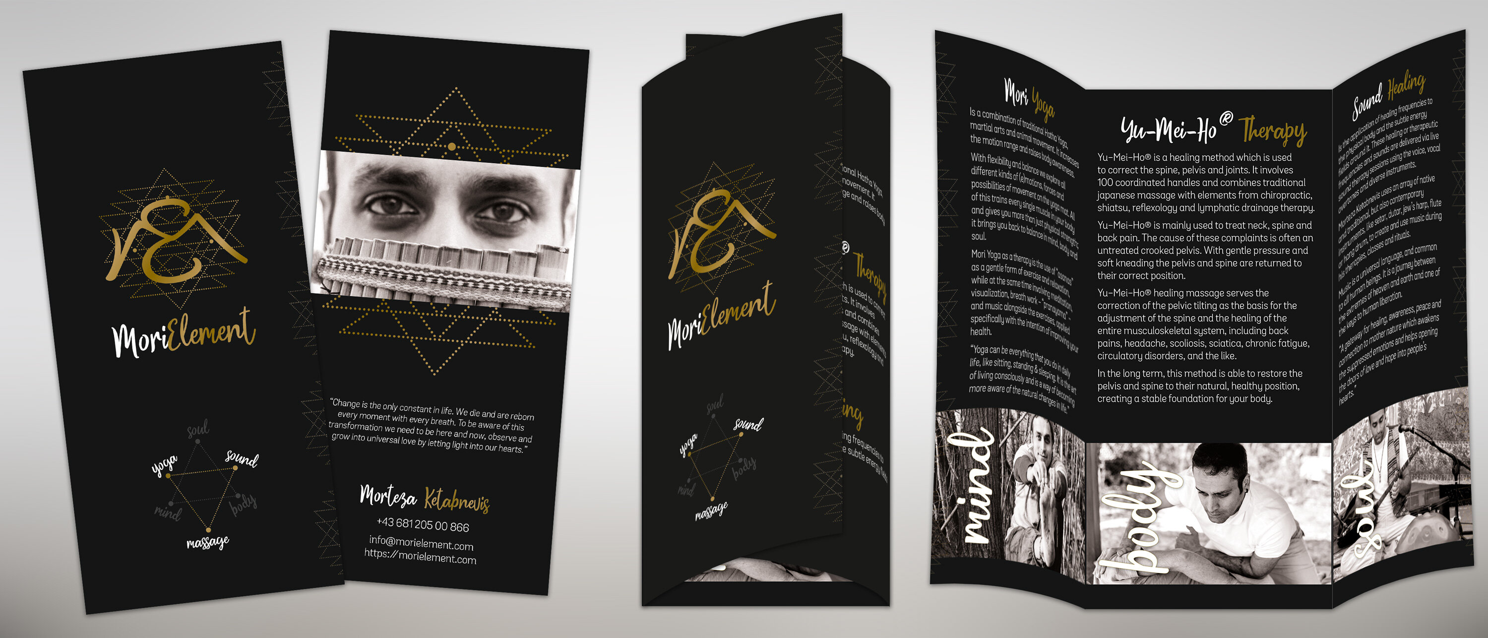
Tactile Connections
For the business cards, I envisioned a square, mirroring the geometry of the logo, to serve as a canvas for connection. It's an invitation in every hand, a promise of healing touch in every exchange. The massage coupon carries this promise forward—a tangible commitment to wellbeing, elegantly crafted to be gifted or cherished for future rejuvenation.
The Roll-Up: A Silent Herald
At festivals, amidst the flurry of life and sound, the roll-up stands as a silent herald of peace. It's not just an advertisement; it's a sanctuary in a glance, drawing the eye and soothing the spirit with its sepia-infused imagery and gentle call to rest, reflect, and heal.
In the synergy of visuals and text, the MoriElement brand comes to life, telling a story that transcends the traditional boundaries of alternative therapy. It's a narrative crafted in gold and black, whispered through the sacred geometry that frames our very existence.
Share