Project
Volksoper Wien: A Symphony of Minimalism and Tradition
Brand Design, Print Design
Orchestration of a Visual Identity
I embarked on a design odyssey to reimagine the Volksoper Wien's identity. My vision harmonized the grandeur of opera with minimalist design principles, creating a logo and graphic elements that resonate with the architectural beauty and the vibrant spirit of performance art.
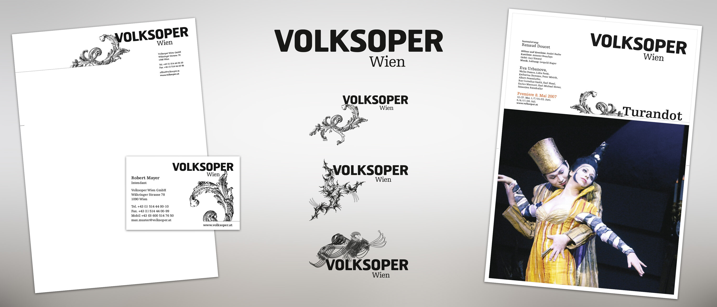
The Dynamics of a Minimalist Logo
Crafting a minimalistic logo for the Volksoper Wien, I focused on strong, recognizable fonts paired with dynamic ornamental elements. Drawing inspiration from the ornate Renaissance architecture and contemporary vector designs, the logo exudes elegance and versatility.
Monochromatic Elegance
I chose a monochromatic color scheme to let the opera's colorful imagery take center stage. This design decision accentuates the visual impact of production photographs, allowing them to shine against the understated elegance of black and white.
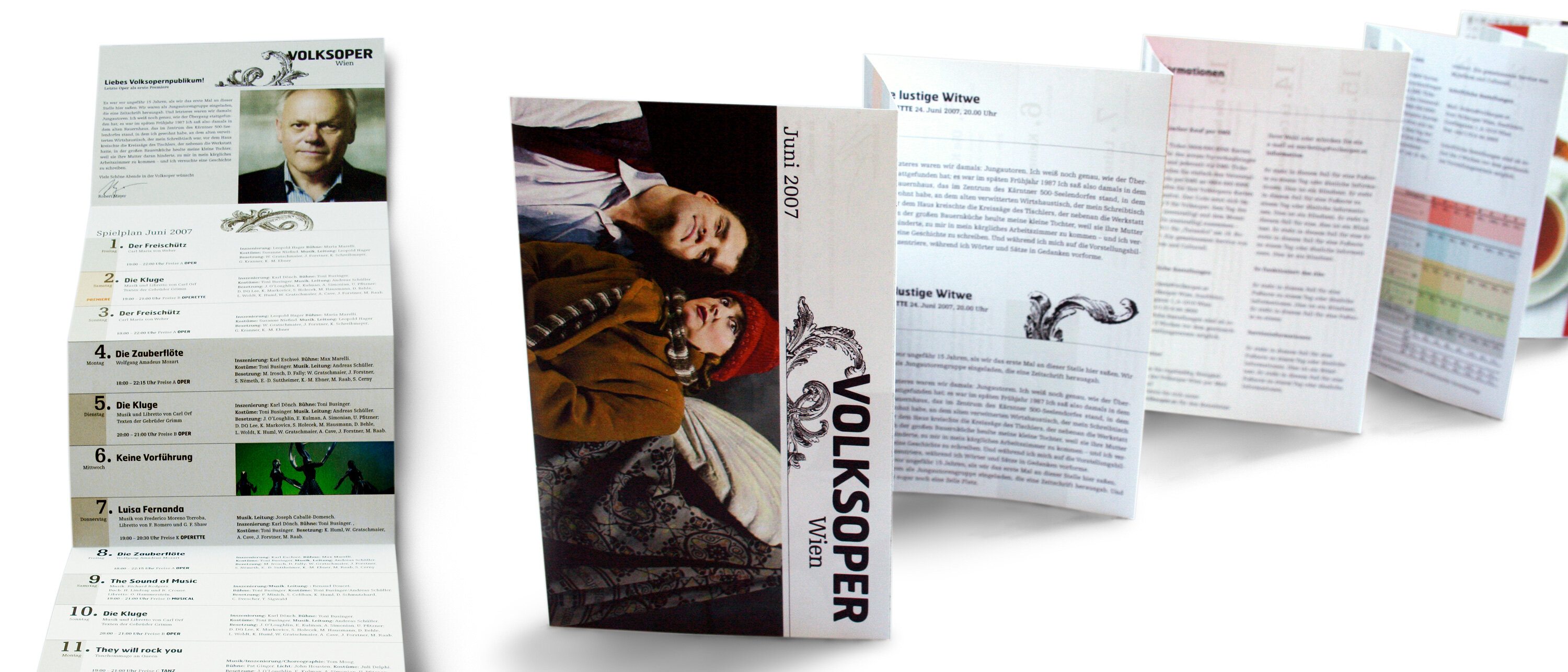
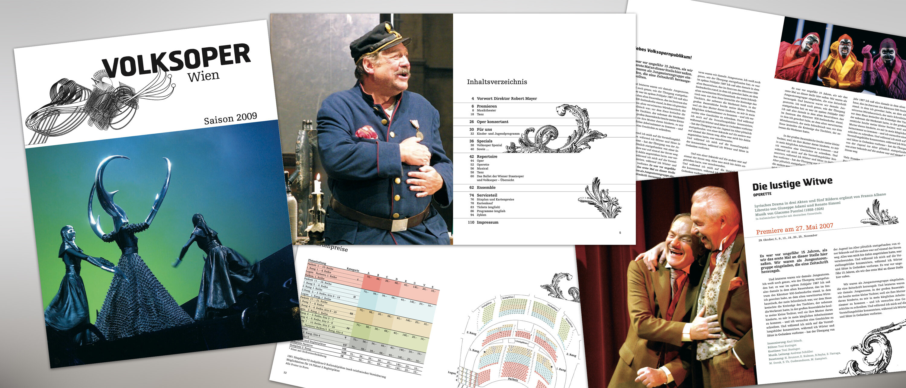
Composing with Paper and Space
The business cards, letterheads, and leporello folded flyers are a testament to the brand's new visual symphony. With meticulous attention to space and form, I ensured that each piece of stationery was not just functional but also a bearer of the Volksoper Wien's new aesthetic.
Subtle Hues in Print
While black and white form the core of the brand's design, I introduced soft, washed colors in the flyers and brochures for subtle distinctions. These gentle hues serve as a visual whisper, guiding the eye through the content while maintaining the minimalistic integrity of the design.
Share