
Project
Wienerlinien Bahnbau: The Pulse of Vienna’s Night
Brand Design, Print Design, Packaging Design
Designing for a Lifeline:
The Wienerlinien Bahnbau project bestowed upon me a unique challenge: to visually encapsulate the unseen nocturnal efforts that keep Vienna moving. With a given logo and stringent brand guidelines, my task was to weave the existing identity into a narrative that spoke of the night's diligent toil.
Harnessing the Night:
Capturing the essence of the railway's overnight transformation, my team and I ventured into the silent hours between midnight and the first light. The resulting array of photographs—each a dance of sparks and shadows—served as the foundation of our visual storytelling.
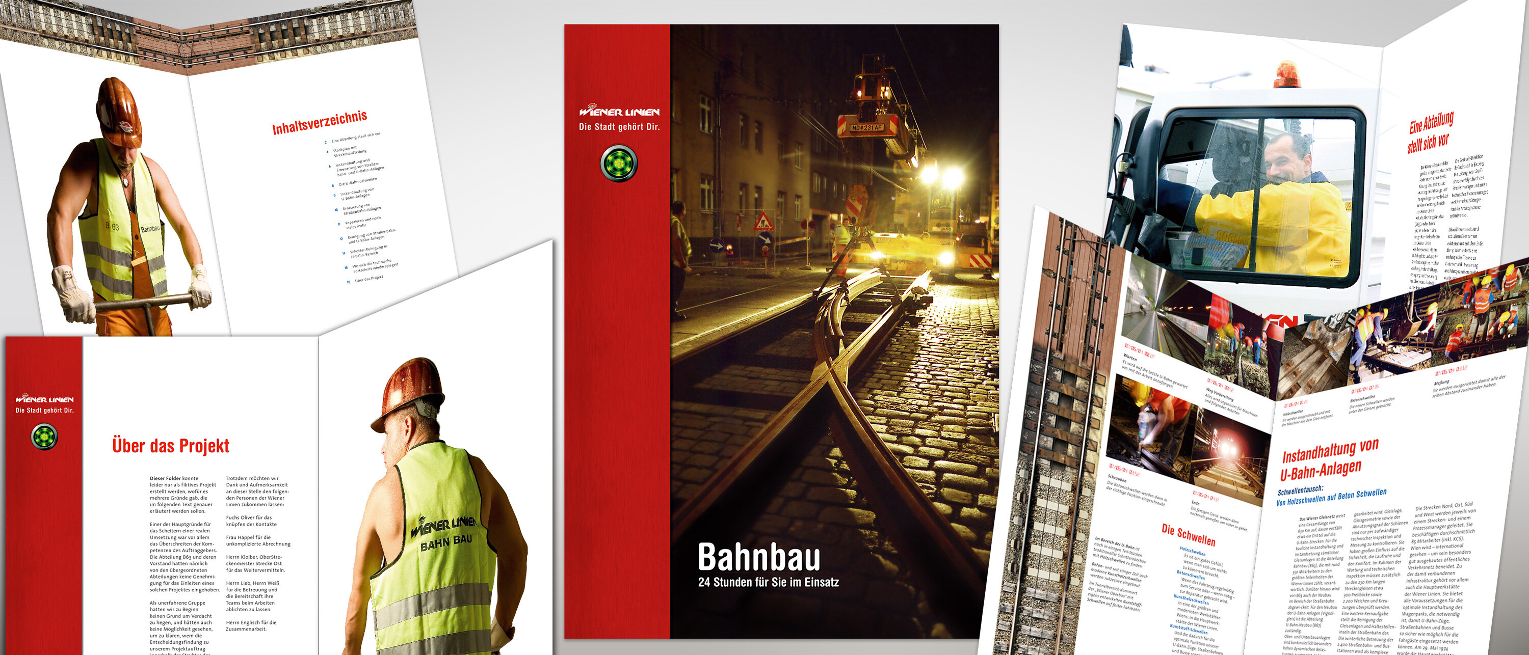
The Flyer - A Night in Hand:
A compact, folded flyer became the first ambassador of this nightly endeavour. I wanted it to unfold like a story, revealing the complexity of rails and machinery in a dramatic montage that stretched across its span.
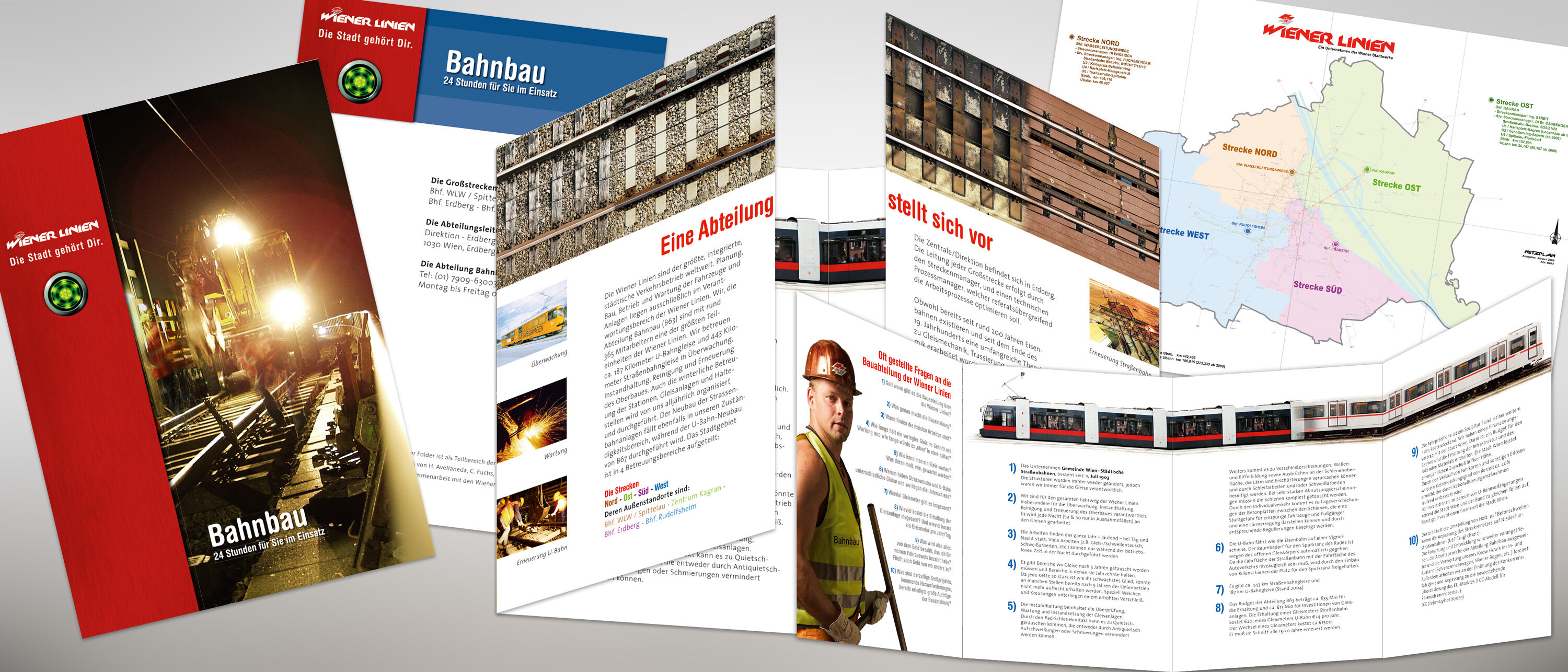
Brochure - A Tome of Twilight Labour:
The A4 brochure expanded on this nocturnal ballet, offering insights and perspectives that only the witching hours could provide. A blend of ground-level grit and aerial views of the construction sites, combined with a dedicated photoshoot of the workers, furnished a comprehensive look at the dedication behind the service.
Multimedia Documentation:
The project called for a harmonious collaboration with photography and multimedia teams. It was an exercise in precision, timing the documentation to capture the most evocative imagery of rails being welded and replaced, set against the backdrop of Vienna's luminescent skyline.
DVD Case & Print - A Visual Chronicle:
The case and DVD design encapsulated the project’s spirit—a digital compilation of the hard hats, bright vests, and the sparking showers of maintenance work. It was designed to be both a keepsake and an informational resource, detailing the meticulous processes that go into maintaining Vienna's lifeline.
Map of Movement:
The back of the flyer introduced a special touch—a map used by the construction division, not commonly seen by the public. It provided an intriguing glance into the planning that orchestrates the smooth flow of Vienna's public transportation.
A City's Unseen Backbone:
This project was more than design; it was about showcasing the commitment of Wienerlinien Bahnbau. It was a tribute to those who work in the shadows to ensure that Vienna remains connected, pulsating with the rhythm of a world-class public transport system.
Share