Project
COLORbite: A Chromatic Vision in Brand Design
Brand Design, Print Design
Unveiling COLORbite's Brand Essence
At the helm of COLORbite's brand revolution, I crafted an identity that celebrates the fusion of technology and creativity. The brand represents a multimedia and advertising agency whose narrative is painted in the hues of innovation and vibrancy.
The Pixel Reimagined
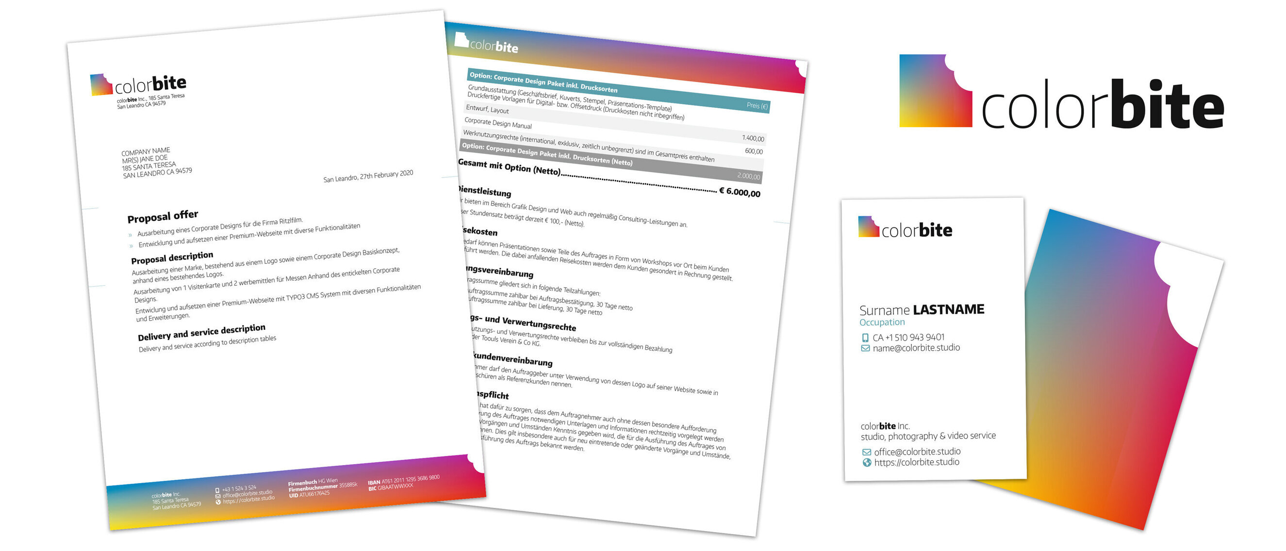
The logo, a pixel charmingly bitten, symbolizes a departure from the mundane, embracing a world where creativity knows no bounds. This emblem is a beacon of COLORbite's ethos, where a single pixel is the canvas for infinite possibilities.
A Symphony of Gradients
The logo's gradient spectrum is a testament to limitless imagination, each color transition representing the seamless blend of ideas and narratives. The brand's palette, ranging from the calmest blues to the most passionate reds, echoes the diversity of COLORbite's storytelling prowess.
From Byte to Bite
The clever interplay between 'byte' and 'bite' infuses the brand with an inviting, playful spirit, suggesting a readiness to delve into the digital domain with a taste for the extraordinary.
Crafting Tangible Brand Stories
My design journey with COLORbite extends to creating a coherent suite of business materials, each echoing the logo's dynamic essence. The business cards beckon with color, and the letterheads speak the language of the brand's core values, solidifying COLORbite's commitment to design excellence.
Share

